
Trail-use intelligence for wild places
TrailCount pairs rugged, battery-powered trail counters with a cloud platform that turns raw hiker detections into decisions: where pressure is building, which trailheads carry the load, and how use moves with the seasons. An infrared sensor logs each passer-by to an SD card; once a day the unit wakes and uploads over LTE-M cellular — no cameras, no solar panel, no visitor interaction. This short tour walks through every page of the dashboard using the demo, populated with simulated data — the same software that serves live counters in the field.
Use the contents on the left, the arrows below, or your keyboard’s ← → keys to page through.
Sign in and land on the map
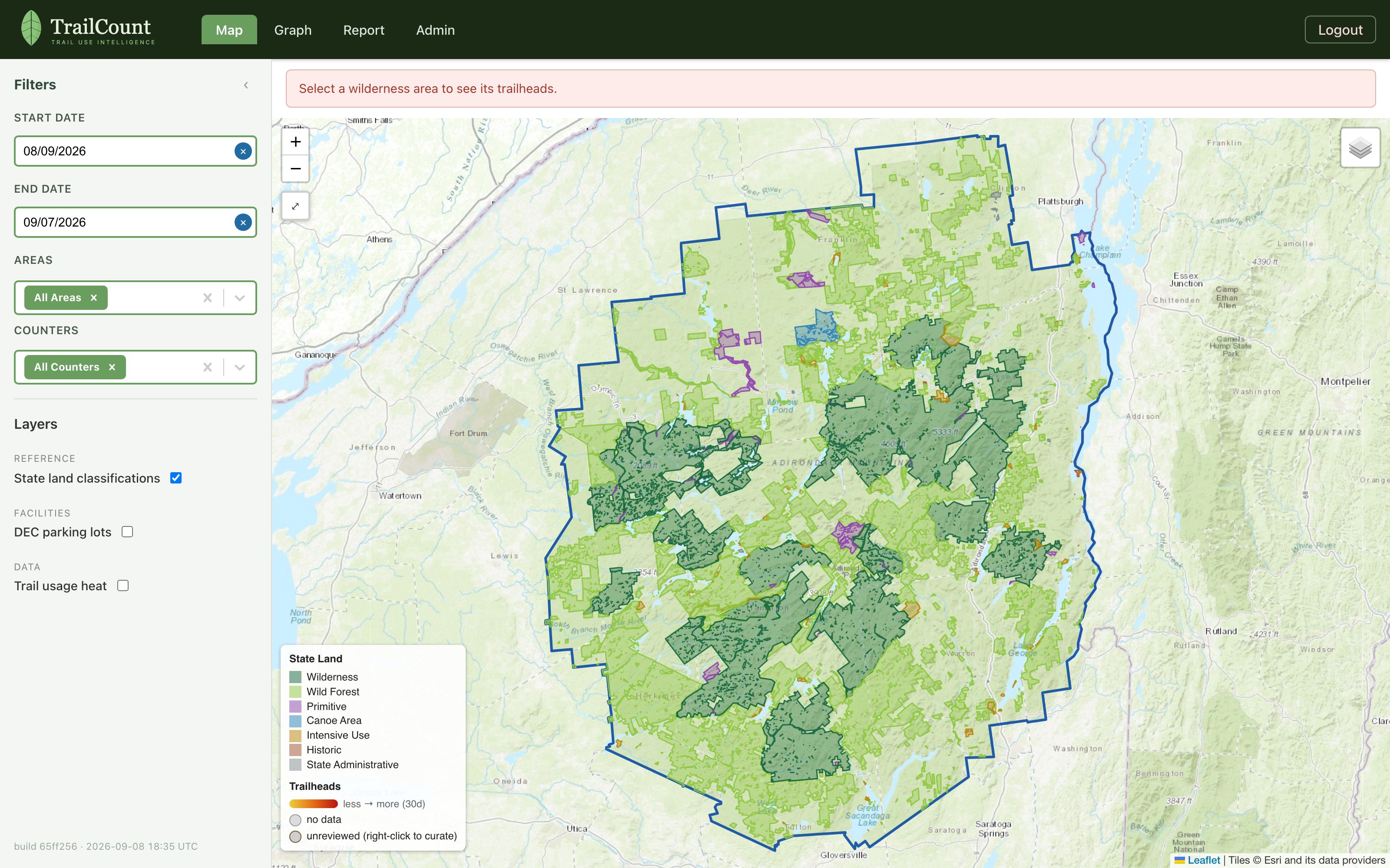
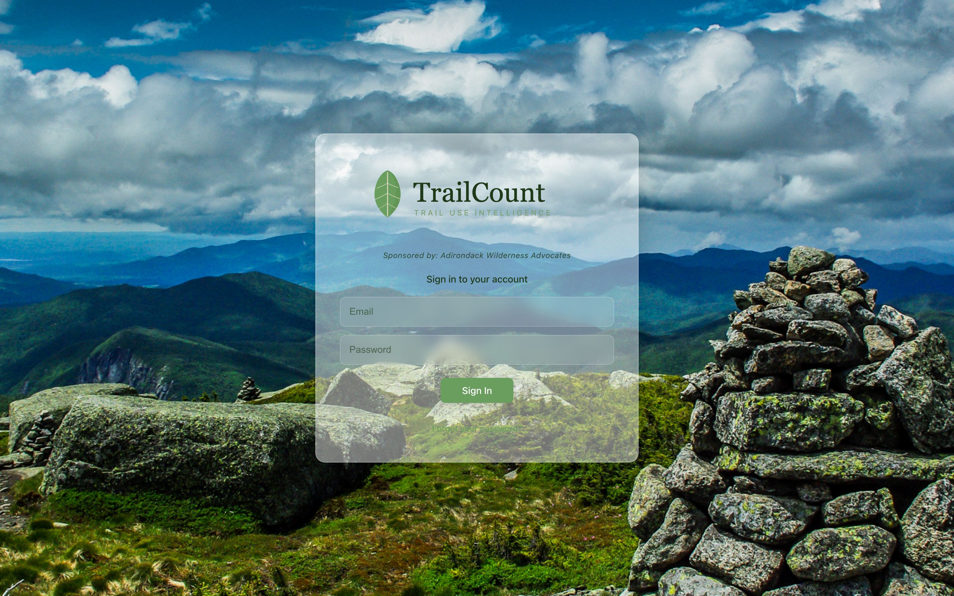
Access is by invitation — an administrator creates your account (more on that in the Admin chapter). Signing in drops you onto the map, framed to the whole park, with your filter selections remembered per session as you move between views. Password reset is self-serve from the sign-in page.
One filter panel, every view
The left panel reads identically on the Map, Graph, and Report: a date range, the wilderness Areas you care about, and the individual Counters within them. Below the divider live the view-specific controls — the View menu and grouping on Graph and Report, the overlay layers and heat sliders on the Map.
- Dates default to the last 30 days, ending yesterday (today’s data hasn’t uploaded yet).
- Areas is a multi-select — pick several to compare them side by side.
- Counters auto-fills with the selected areas’ counters; prune or search to focus.
- View (Graph and Report) switches among over-time, typical-hour, typical-weekday, seasonal, and week-over-week lenses.
- The footer shows the exact build you’re running — handy when confirming a fresh deploy.
The park, its lands, and its trailheads
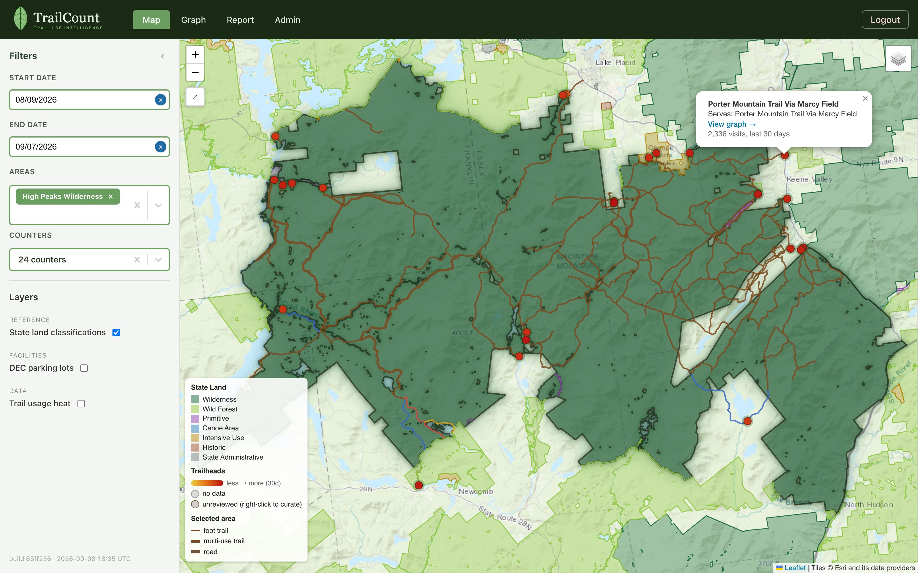
The map layers the things stewards actually reason about: official state-land unit boundaries (from the Adirondack Park Agency’s land classification, simplified so shared borders stay coincident), DEC trail lines colored by blaze, and trailhead markers colored by recent traffic. Selecting an area outlines it with a glow, frames the view, and reveals its trails and trailheads.
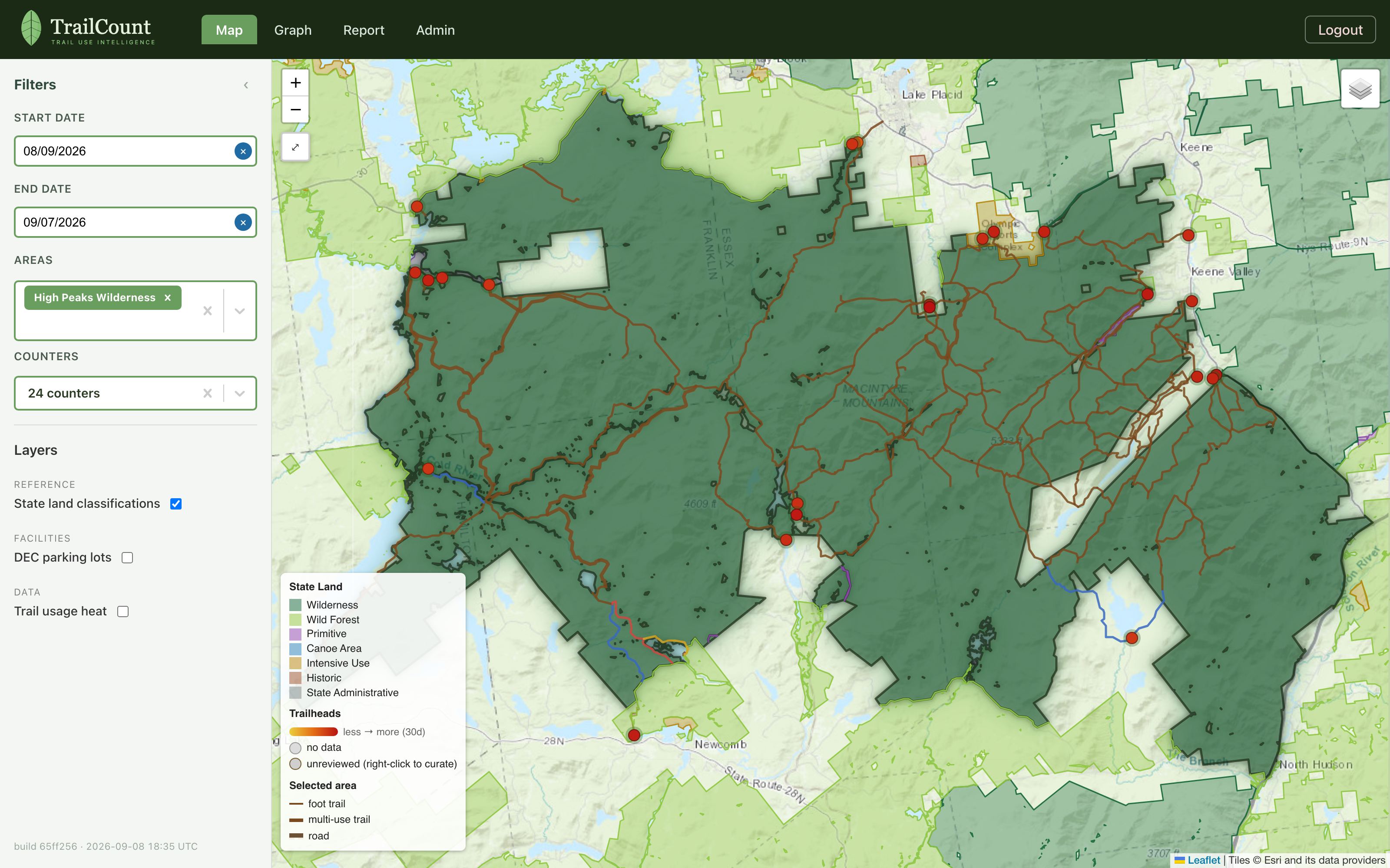
- The Layers panel toggles state-land classifications, DEC parking lots, and trail-usage heat.
- Ten switchable basemaps (Esri topo by default) — terrain, satellite, USGS, and more.
- Select multiple areas and the view frames all of them together.
- Click any trailhead for its details — and a one-click jump to its graph.
Heat that follows the trail
Most heat maps draw circles around points. TrailCount’s usage layer follows the actual trail network: each trailhead’s glow walks its DEC trails into the backcountry, fading with distance along the trail. A busy flagship trailhead runs wide, deep, and red; a quiet one is a thin yellow thread.
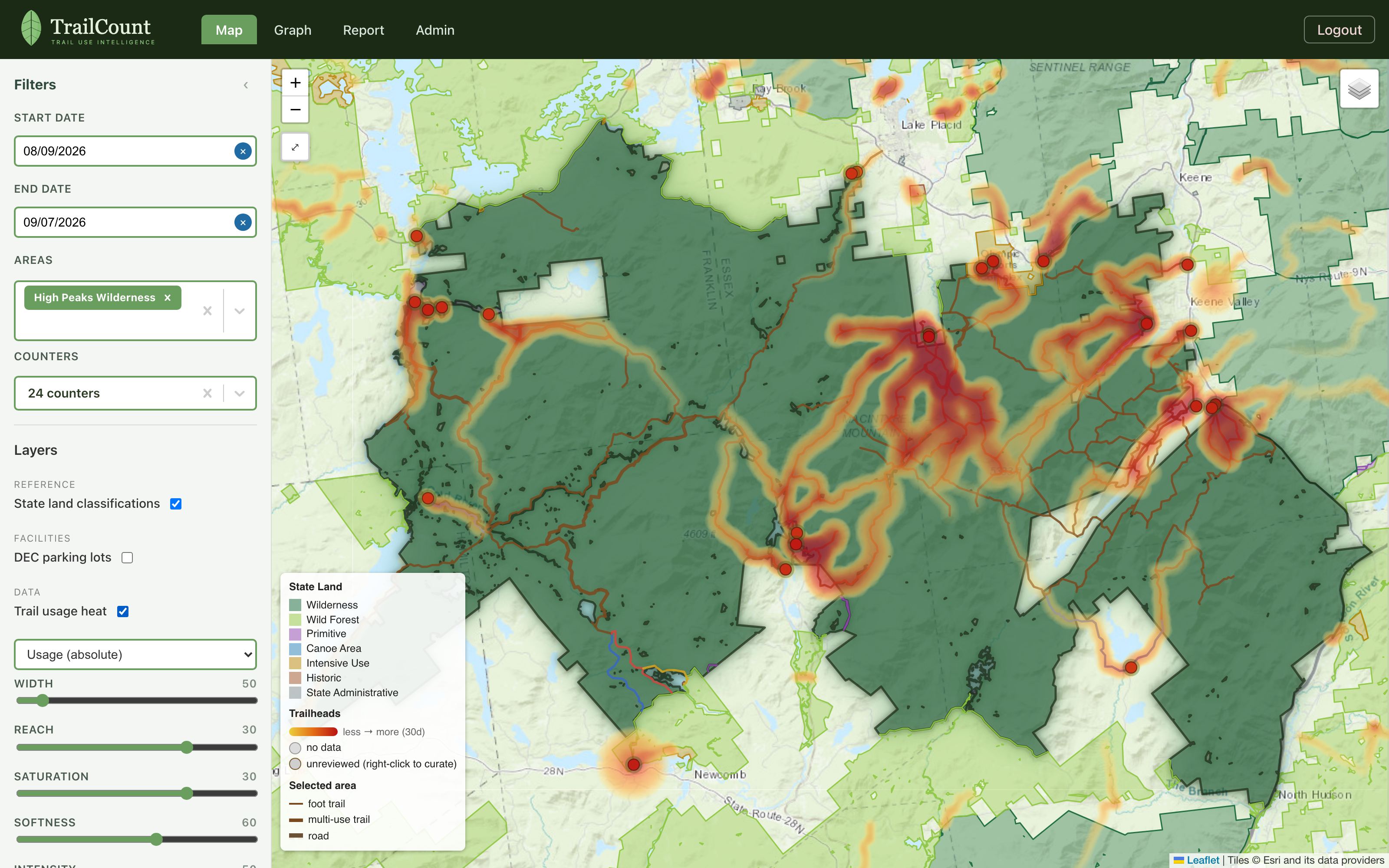
- Usage (absolute) is yellow-to-red by traffic. Vs median is blue below / red above the typical trail.
- Width and Reach set the busiest trailhead’s footprint; everything else scales beneath it.
- Curation feeds the heat — reject a trailhead or fix its trails and the glow follows the catalog.
From one counter to a whole wilderness
The Graph’s default Over time view plots hiker counts over any date range, grouped by hour, day, week, month, or year as the span allows (hourly for a week or less). Select a whole area and it stays readable: the five busiest counters get their own lines and everything else folds into a single “All others” series — with the busy lines painting first while the long tail loads.
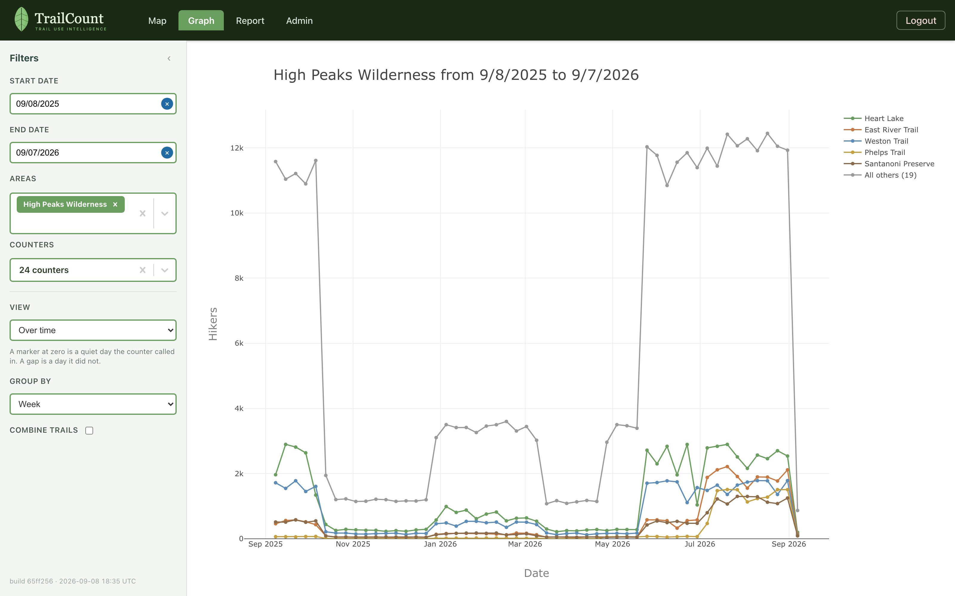
- A marker at zero is a quiet day the counter called in. A gap is a day it did not.
- Pick individual counters for exact comparisons, or check Combine trails for one total line.
- Group by adapts to your range — day for a month, week for a year — and can always be overridden.
When people go, not just how many
Over time is one lens. The View menu folds the same window into the shapes stewards actually ask about — typical hour, typical weekday, the season’s curve — averaged in Eastern Time and skipping days the counter did not call in, so downtime never looks like a quiet trail.
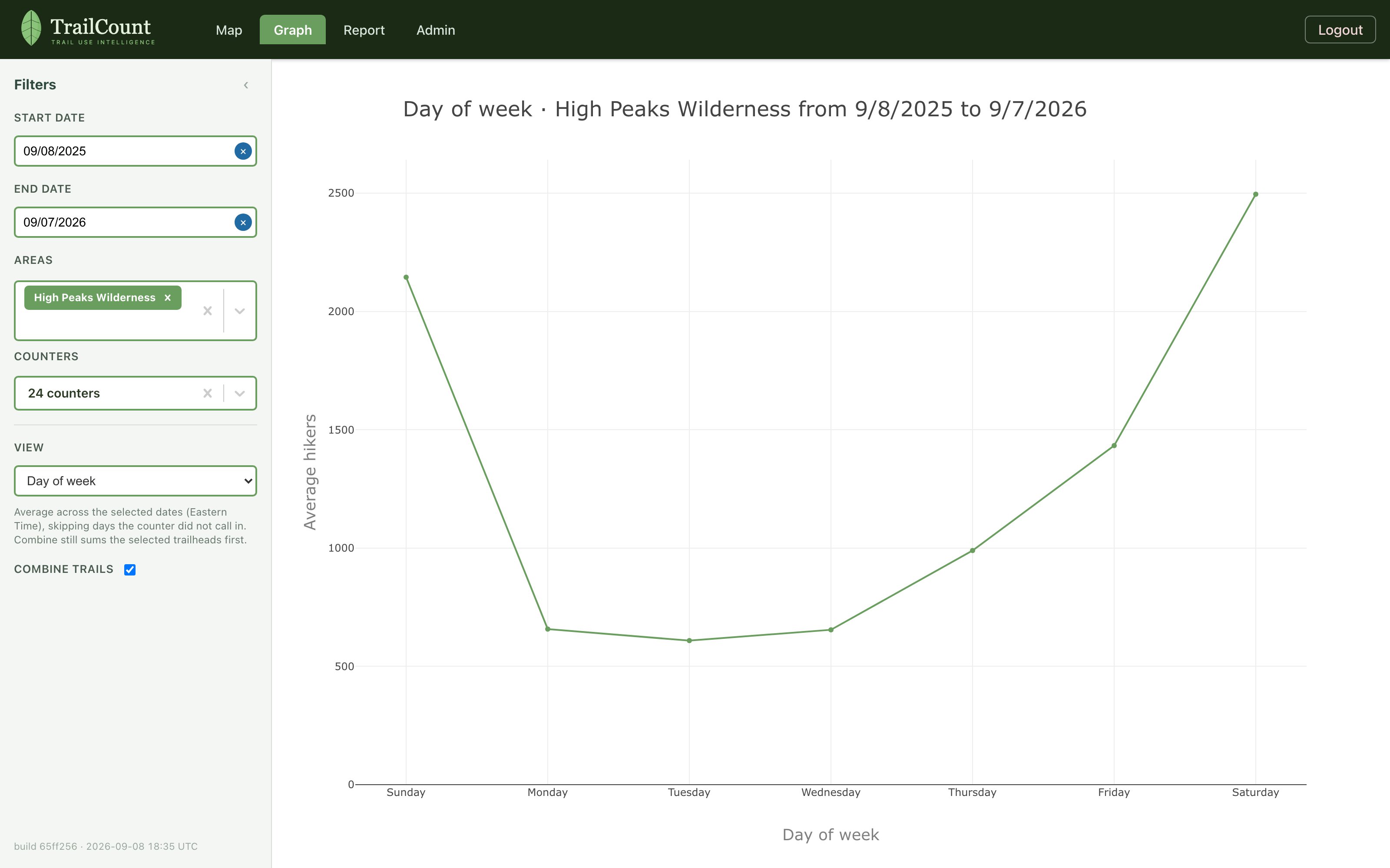
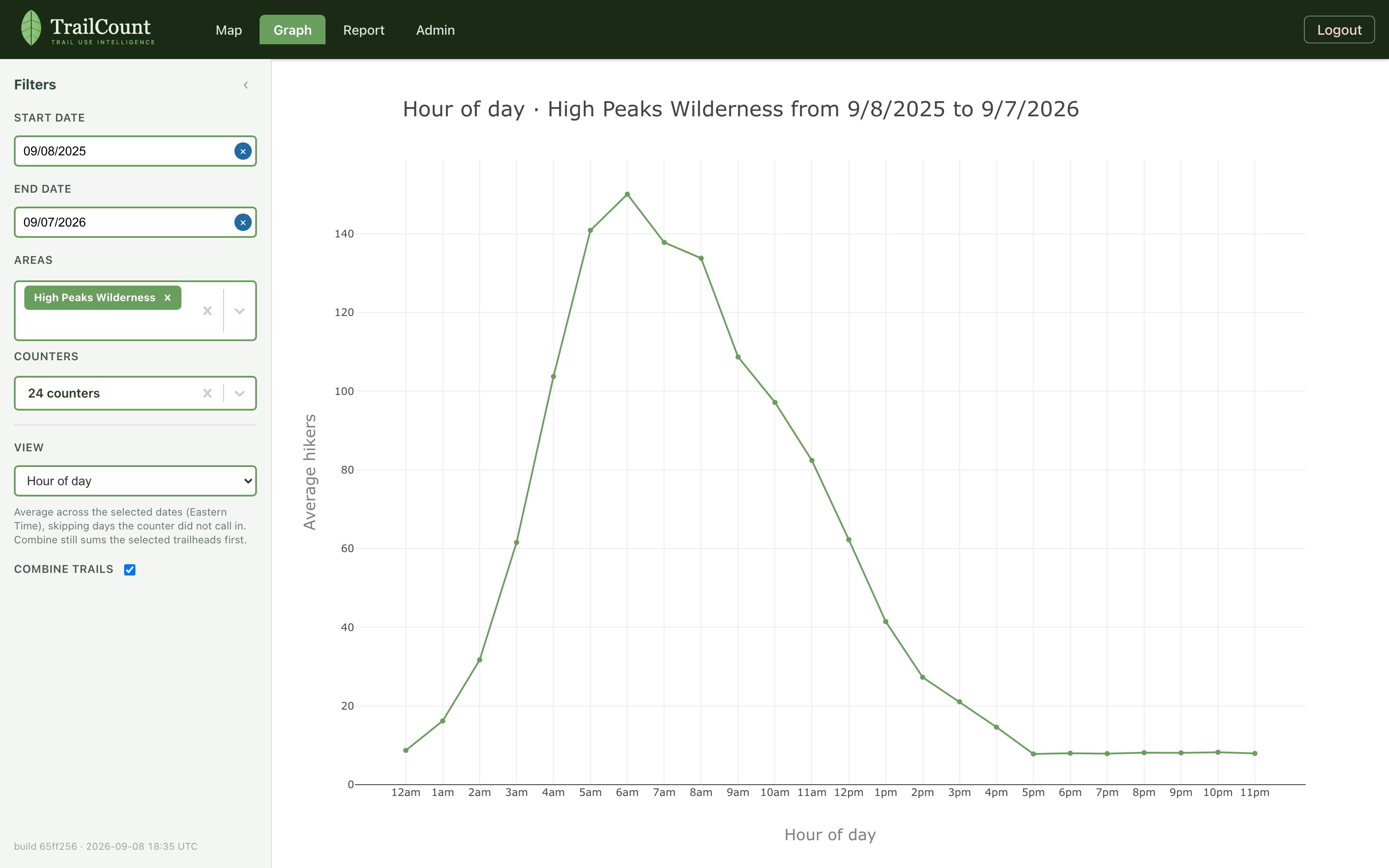
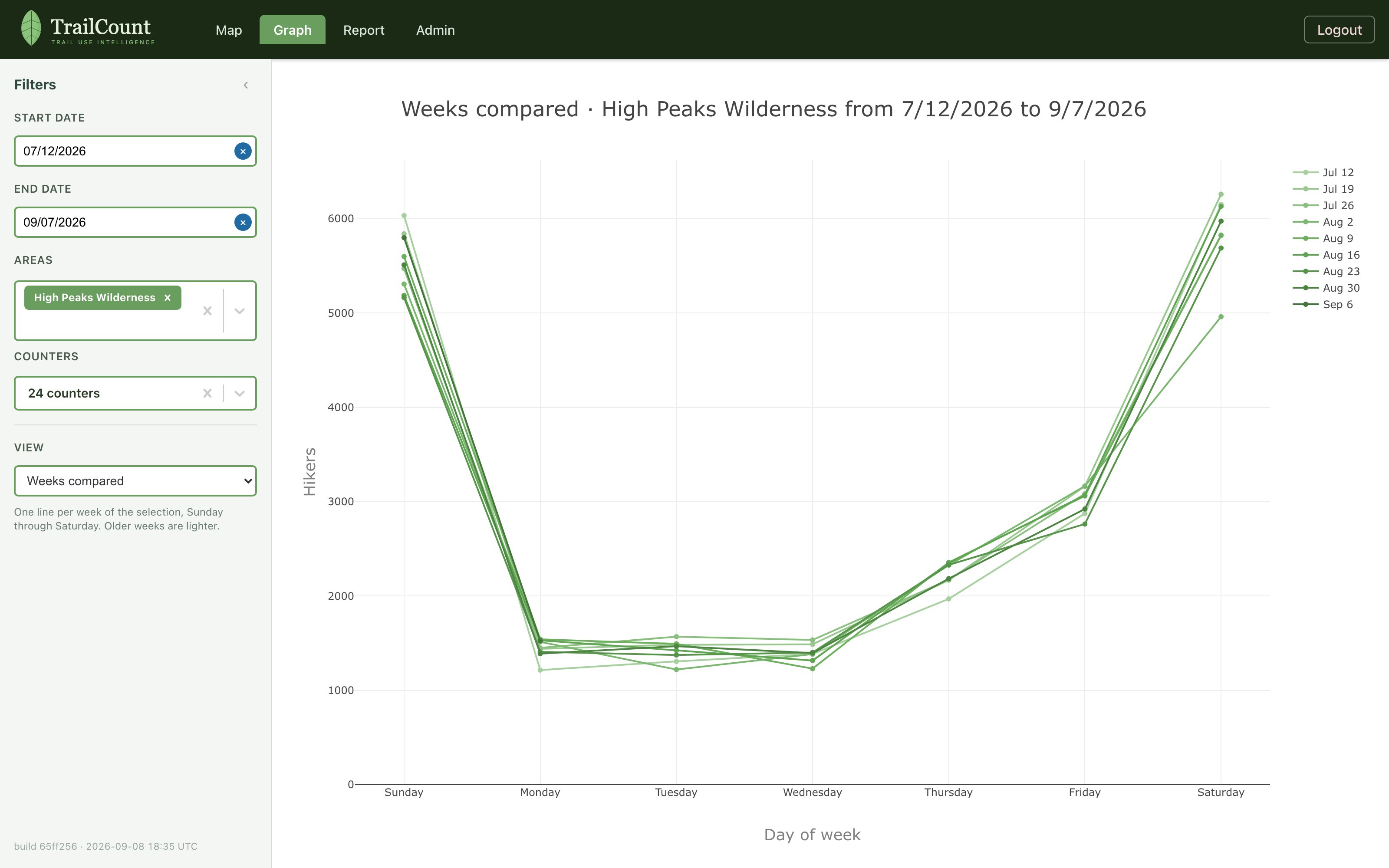
- Day of year and Week of year show the season’s shape — when it starts, peaks, and tapers.
- Combine trails still sums the selected counters first, then averages the combined series.
One line per area
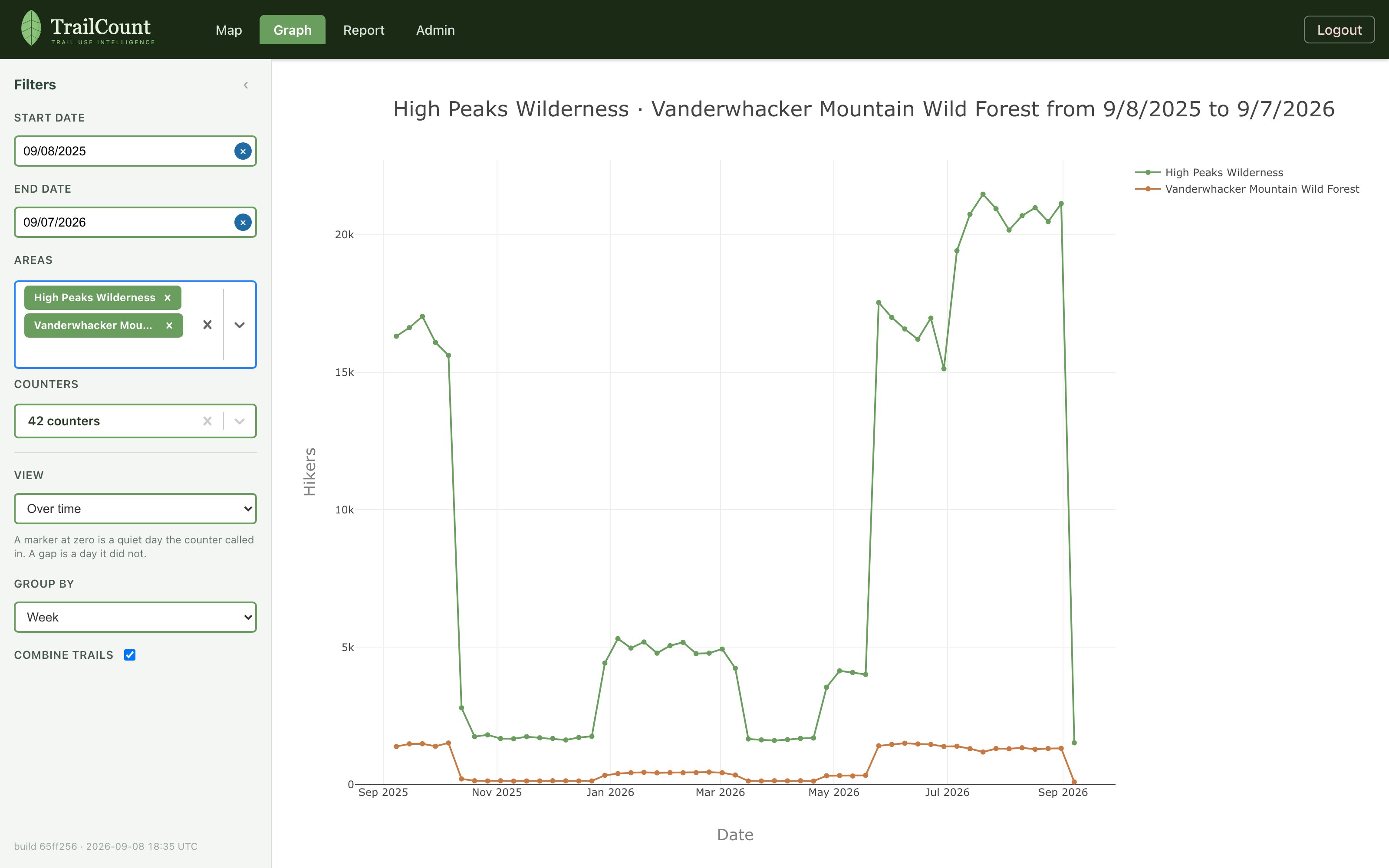
Select several areas and the graph answers the managerial question directly: which area carries more use, and when? Each area’s counters sum into a single named line — High Peaks against Vanderwhacker, wilderness against wild forest, season against season.
Totals you can sort and export
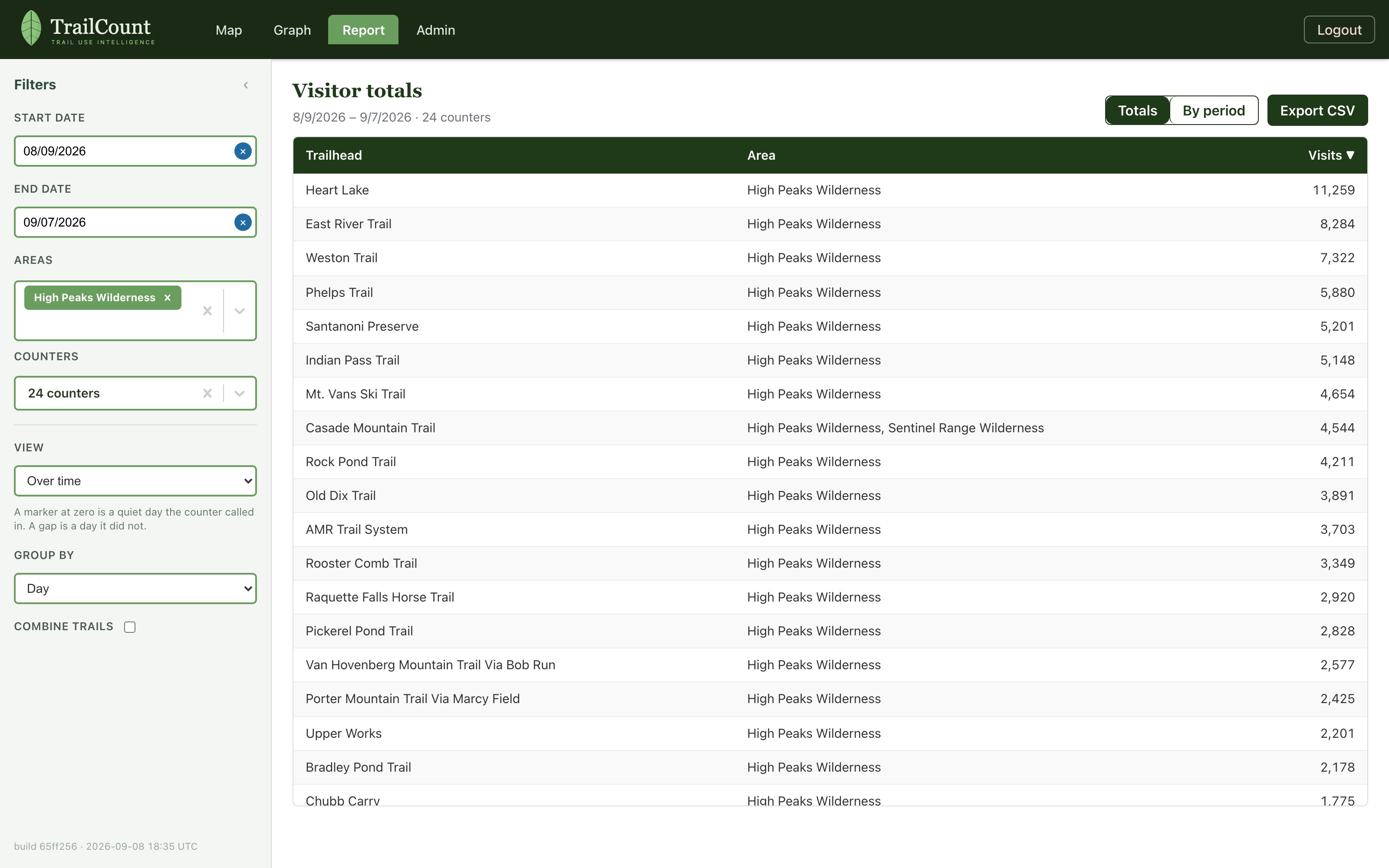
Report is the Graph as a table, over the same dates, areas, and counters. Totals is one row per trailhead for the window — sortable, with a grand total. By period is one row per trailhead × bin, using the same grouping as the Graph. Export CSV downloads exactly what’s on screen.
Curate the catalog, manage the fleet
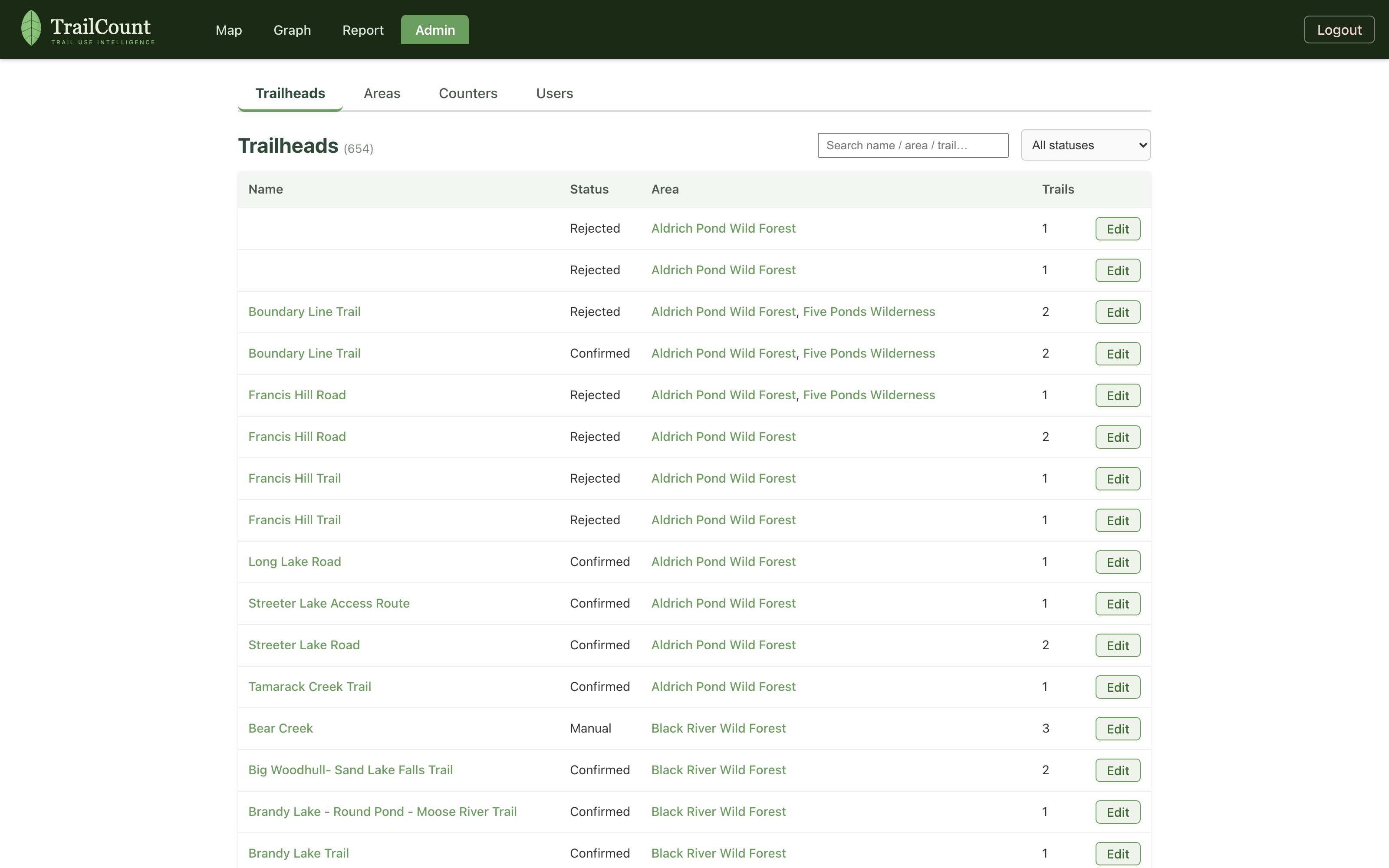
Admin is where the system stays true to the ground: confirm or reject derived trailheads, edit the trails each one serves (picked from the official DEC trail names, so map linkage never breaks on a typo), maintain areas, and watch counter health — battery, firmware, and last call-in for every device.
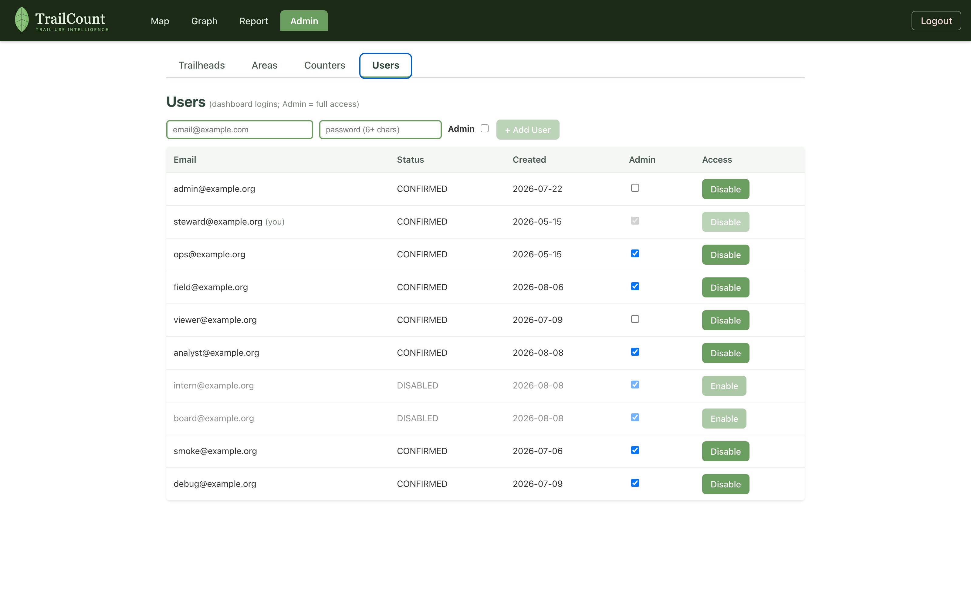
The Users tab manages dashboard access itself: create accounts, grant or revoke admin, and enable or disable a login without deleting it. Only admins see this page — everyone else gets the Map, Graph, and Report, read-only.
Every view has an address
Areas and trailheads are linkable, so a finding can be handed to a colleague as a URL. Map, Graph, and Report share the same query — click a trailhead’s pin and jump straight to its numbers.
- /map?area=High Peaks Wilderness — the map, framed to an area with its trails and trailheads shown.
- /map?trailhead=<id> — fly directly to one trailhead’s pin.
- /dashboard?area=High Peaks Wilderness — the graph, preloaded with an area’s counters.
- /dashboard?trailhead=<id> — one trailhead’s series, ready to read.
- /report?area=High Peaks Wilderness — the same selection as a table.
That’s the tour. Open the demo and try it with simulated data across the park’s trailheads, see the live dashboard, or get in touch to talk about counting your trails.